Existing member? Log in and continue learning
See if you like it, start the course for free!
Unlock full course by purchasing a membership
The Ionic UI Components
The Ionic UI Components
In this lesson, we are going to explore some of the components that Ionic provides us and how we can use those in our templates. Again, I highly encourage you to follow along with these examples and experiment outside of just what I am showing you here.
We are going to switch to just using a standard Ionic application built with the Ionic CLI now, so if you want an example application to follow along with run the following command:
ionic start my-ionic-app blank --type=angularThe cool thing about the blank Ionic starter is that it already has routing and a home component set up for you. As I’ve mentioned, we will be using single file components in this course, but the default blank starter will store everything across multiple files.
Creating templates is one of the most fun bits of building Ionic applications. It’s where the power of using a library that provides powerful web components really shines, as we can pretty much just drop stuff into place with HTML syntax and get an entire mobile interface set up in minutes. Creating interactive elements like a scrolling list doesn’t require complicated JavaScript, and creating beautiful elements like a nicely styled card element doesn’t require complicated CSS - with Ionic’s web components, you can just drop what you need into place. Take this code for example:
import { ChangeDetectionStrategy, Component } from '@angular/core';import { IonHeader, IonToolbar, IonTitle, IonButtons, IonButton, IonIcon, IonContent, IonSearchbar, IonList, IonAvatar, IonLabel } from '@ionic/angular/standalone';
@Component({  selector: 'app-home',  template: `    <ion-header class="ion-no-border">      <ion-toolbar color="secondary">        <ion-title> My Friends </ion-title>
        <ion-buttons slot="end">          <ion-button>            <ion-icon slot="icon-only" name="add-circle"></ion-icon>          </ion-button>        </ion-buttons>      </ion-toolbar>    </ion-header>
    <ion-content>      <ion-searchbar></ion-searchbar>      <ion-list lines="none">        @for(item of items; track $index){          <ion-item>            <ion-avatar slot="start">              <img [src]="item.picture" />            </ion-avatar>            <ion-label>              <h2>{{ item.name }}</h2>              <p>{{ item.description }}</p>            </ion-label>          </ion-item>        }      </ion-list>    </ion-content>  `,  imports: [IonHeader, IonToolbar, IonTitle, IonButtons, IonButton, IonIcon, IonContent, IonSearchbar, IonList, IonAvatar, IonLabel],  changeDetection: ChangeDetectionStrategy.OnPush,})export class HomePage {  items = [    {      name: 'Josh',      description: 'hello',      picture: 'https://avatars.dicebear.com/api/adventurer/abc.svg',    },    {      name: 'Josh',      description: 'hello',      picture: 'https://avatars.dicebear.com/api/adventurer/def.svg',    },    {      name: 'Josh',      description: 'hello',      picture: 'https://avatars.dicebear.com/api/adventurer/ghi.svg',    },  ];}
With no additional styling, the code above would look like this right out of the box:
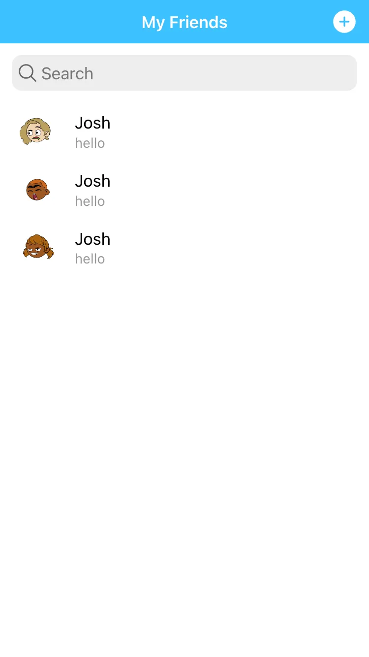
It doesn’t look amazing, but we already have a pretty complex layout set up with just a few lines of code, throw a bit of custom styling in and we’d have a pretty sleek interface. We’re going to go through different aspects of creating templates in Ionic more thoroughly in just a moment, but I wanted to give you a sense of what a full template for a page might look like, and also how easy it is to use the components provided by Ionic.
We already know the template syntax that Angular adds like {{ interpolations }}, [propertyBinding], (eventBinding), and more. Now we are going to take a look at some Ionic specific concerns when it comes to the template and we will more closely investigate some of the components Ionic provides.
Slots
You may have seen multiple references to a slot attribute being attached to elements - we saw this in the example we just looked at above. A slot is a web component concept that allows us to control how particular elements are displayed. When the Ionic team creates their web components, they are able to use “slots” which are kind of like placeholders for where content will be injected.
If we take the <ion-buttons> component as an example:
<ion-toolbar> <ion-buttons slot="start"> <!-- buttons go here --> </ion-buttons><ion-toolbar>This is used inside of the <ion-toolbar> component. When we add buttons to the toolbar, we may want them displayed on the left side of the toolbar, or on the right side of the toolbar (or both). So, when the toolbar component is designed by Ionic, “slots” are added to both of these areas.
We can then specify which “slot” we want to inject our <ion-buttons> component into. Since we are using start our buttons will be placed on the left hand side of the toolbar. This won’t always be the case - generally Ionic automatically adapts to whatever platform it is running on and will adapt its styles/layout as much as possible. The reason we use start instead of left is because for some regions the “start” or “beginning” position might actually be on the right hand side.
You will see this pattern of either slot="start" or slot="end" used on a lot of components to specify their position. However, “start” and “end” are not the only kinds of slots. For example, for an <ion-icon> we might specify <ion-icon slot="icon-only"> to indicate that this icon is being used as a standalone button with no associated text.
It won’t be immediately clear what “slots” are available, or what they do, so you will often need to refer to the documentation for the specific component to figure out how to style your component correctly. Just go to the slots section of the documentation for the component you are working with.
Using Ionic Components
We’ve covered a lot of Angular specific concepts related to the template, now let’s look at some things to keep in mind when creating a template with the Ionic components. Let’s start with the layout of a basic “page” in Ionic. Remember, a “page” is just a normal component that is being routed to - but they will typically look a certain way. A “page” or “view” in a mobile application will typically have things like a header section with a toolbar, a content area, and maybe even a footer. Within this “page” component, we would place additional components (usually within the content area). The page component itself is often just a skeleton of the overall structure of the view, and the additional components make up what is displayed within that view.
In Ionic, we can easily set up the structure for a basic page using these components:
<ion-header>  <ion-toolbar>    <ion-title> Ionic Blank </ion-title>  </ion-toolbar></ion-header>
<ion-content class="ion-padding"> </ion-content>
If you use the Ionic CLI commands to generate a new page, this is the automatically generated template you will get. All of the elements here are web components which are provided by Ionic. As we have discussed, a web component is basically a custom HTML element with styles and behaviours attached to it. This allows us to drop complex mobile user interface elements into our templates easily (since Ionic has already done all the hard work for us).
Although it looks simple here, there is a lot of work going on behind the scenes. We can open up the browser’s debugging tools and inspect what is actually injected into the DOM in place of the template we have created:
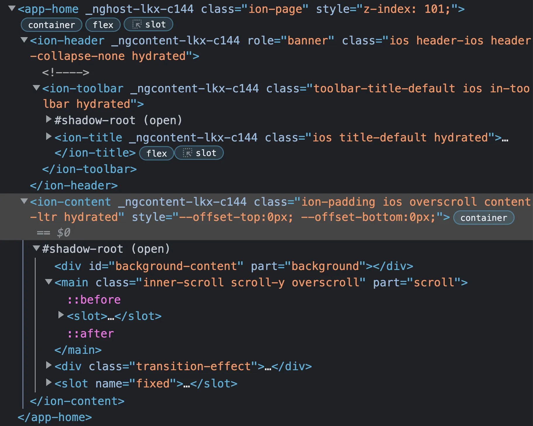
Remember that since they are just web components, you can use them anywhere, we just happen to be using them in an Angular application. When we create our own components in Angular - all of the “pages” we create are components, for example - they are Angular components not web components. They behave in a very similar fashion. For example, when we use one of Ionic’s web components it looks like this:
<ion-header>Thanks for checking out the preview of this lesson!
You do not have the appropriate membership to view the full lesson. If you would like full access to this module you can view membership options (or log in if you are already have an appropriate membership).